Special Effects/Animation
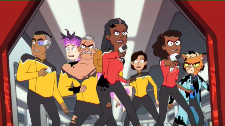
The animation can be broken down into two different ideas. The first is whether or not the animation is done and done well. The other is whether or not the animation can be timeless, while also maintaining the show’s unique identity in the process. A property that can create a timeless idea that will always identify the property is important. For instance, it’s why Zelda: Wind Waker holds up better visually than Zelda: Twilight Princess.
One tried to be cutting edge while the other tried to have an identity.
So how’s the animation in Lower Decks? It’s graphically well done. Its tight lines are appreciated, the color schemes are not so wild that it’s hard on the eyes but there’s enough vibrancy within the show to make it interesting to look at. All without putting so much out there that it becomes a strain. The motions feel fluid and there wasn’t a penny spared in the animation aspects of the show. It’s a beautifully constructed piece of work.
That has no originality to speak of.
This show is a copy and paste clone of Rick and Morty. In twenty years when this show is rediscovered by whatever generation hates Zoomers the most, someone’s going to ask why Rick and Morty had a Star Trek spinoff and no one is going to know why. The reasoning for the style is obvious, to try and appeal to the Rick and Morty fandom.
It’s why Final Space, Solar Opposites and so many other shows are embracing that idea right now, to try and cater to that specific fanbase. Why? Because originality doesn’t exist in Hollywood apparently?
The desire to make it like every other clone series will cost the series its identity and make it just another dollar store version of something more popular.
Grade: 2/5
