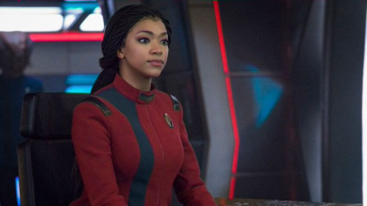
The new Star Trek shows have given fans a whole host of new uniforms.
The Star Trek series is known for its iconic uniforms, which usually changed from series to series and film to film. Even if they try to pay homage to more classic versions of the uniforms, there’s always something different about them. Something that makes them more unique to that specific film or series.
Usually, they’re bathed in either red, gold, or blue, and are adorned with the Star Trek Delta Symbol. That’s not always the case though as some films, like the original series, and shows, like Discovery, went with a more uniform idea, getting rid of the color to mark what branch of Starfleet they’re in.
A show is almost defined by their uniforms, and these new Star Trek shows are no different, so we’re going to take a look at the uniforms and rank them from worst to first. Keep in my this is not a definitive list and only one person’s opinion.
Ranking the Star Trek uniforms from the new generation of shows.
6. Picard: Black/non-uniforms
The Starfleet uniforms in Picard are a bit rough. They’re rather bland and seem like a fan-made version of the original Next-Generation outfits. That didn’t help things but it was made worse by the fact most of the main cast never wore a Starfleet uniform in the show’s first season. No uniforms are always the worst.
5. Discovery – Blue, and Gold
This isn’t a dig at Discovery, if we were ranking each film and series, the red-coat era of Star Trek films would be right next to Discovery. Trek is known for its easy to distinguish color scheme, so everyone knows where everyone is working. To get rid of those outfits for these static, uninspiring outfits was just the worst. At least they could’ve gone the Enterprise route, and had their specific branch colors on the outline of the suits.
4. Lower Decks – Power Ranger look-a-likes
This is the best way to describe these uniforms. It’s that little bleeding of color that goes up from the base of the coat, up through the black, almost like some etch-a-sketch squiggle. They’re not bad by any means but they’re almost too cliche.
3. Discovery – Post time travel
A simple look, but a new take. They’re mostly a single color, with a strip of grey to help accent it, and are really well designed. Unlike other Trek outfits, however, these are a coat of some kind and because of that, they tend to flare out at the bottom some. Plus, they’re uneven at the bottom and that seems like a stylistic choice that didn’t need to be made.
2. Prodigy – Cadet grey
These were very nice. Invoking images of the Red Squad from the 90s, these outfits really stand out, despite the fact they’re all dark blues and light greyish blues. They also fit the tone of the show, as none of these cadets have any idea what they want to be in Starfleet, so there’s no point in giving them any type of distinguishing color.
1. Discovery – Classic sets
Simple, elegant, and well done. Discovery nailed it with these re-imagined outfits based on the original series. No longer shirts, like in the original, and more tactile turtlenecks, these long-sleeved beauties truly capture the spirit of the original design and update them to fit better with modern costume design.
