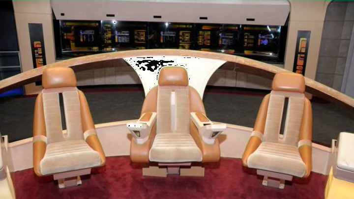
In Star Trek: Picard, Picard said it in jest, but truth be told, we DO miss that carpeting.
Star Trek: Picard’s “Enterprise-D” returned to TV in a way we’ve been emotionally missing for years and why ‘Enterprise-D’ still looks futuristic 36 Years Later
There’s a reason and it really goes back to Roddenberry’s original vision for “Star Trek: The Next Generation.” He specifically stated in the Star Trek series Bible, we’d progressed 85 years since the original series (and movies) and technology had progressed as well. Those early days were over and the Enterprise was now home to families, and it had better be inviting to those on board who weren’t “Starfleet.” The new Enterprise’s 15-year mission would represent a significant chunk of time to family and crew, so “comfort” was a priority.
The goal: an inviting workplace and home. Carpeting and decorating the bridge in warm colors would be a must. Who wouldn’t like an 8-hour shift on a pleasantly appointed bridge and then retire with family in equally inviting (and spacious) quarters?
Star Trek: Picard’s Enterprise-D recaptures the 23rd century mature, softer, and organic future.
Post-Star Trek: The Next Generation we’ve been introduced to “Enterprise-E” and “G”, as well as other Starfleet vessels (“Voyager” and “Stargazer” come to mind). These designs are more of a throwback to “Star Trek: The Motion Picture” or even the original series. Subsequent TV series have returned to “battleship” military sensibilities, leaving the future looking more like the past. Wasn’t the charm of TNG its dramatic departure from the original series and movies “hard look”?
All new “Star Trek” series ascetically reject, rather than adopt the sophisticated, organic Next Generation vibe. We are reintroduced to a military-style vessel with busy technical displays from floor to ceiling, dark lighting, metal decks, shiny floors, and in the most recent interactions, adding to the eye-strain, neon-inspired lighting. Wow!
To be sure, our current technology updates with real-time, animated displays and adds the necessary dim stage lighting to show them off as evidenced in this video uploaded by Trek Central. These “Star Trek” post-TNG sets do offer a technical eye candy smorgasbord, but as was mentioned in an online presentation, when recreating the “Enterprise-D” bridge today, producers realized there was much more to classic TNG’s “look” which couldn’t be replicated on computer without some technical “retconning”. The production crew deliberately “softened” the LCD display features on the rebuilt “D” bridge through software to better mimic the more organic (and “no-tech”) incandescent back-lighting, physical gels, paper, and polarizing light tricks. These changes naturally softened the current “hard readout display” lines absent on that 1980’s bridge – an accidental difference us computer savvy and generally eye-fatigued viewers would instantly notice today.
Which brings up an interesting point: Did we “miss the boat” on post-TNG redesigns?
Somehow, maybe 1980s’ budget and technological restrictions actually improved “Enterprise-D” by making simpler displays seem more natural for the 23rd century. As an example, anyone comparing a commercial 1960s’ aircraft flight deck with its 21st century equivalent would notice simplified control readouts (in full color) with changing computer driven displays, depending on function, just like our “Enterprise-D.”
Lastly, and maybe most striking, is the starship model itself. Our “Enterprise-D” has no exterior straight lines. Everything is curved and organic; very natural-looking and pleasing to the eye. It doesn’t look imposing or military, a good trait to have when visiting “strange new worlds” and for first contact. She may jokingly be called “the fat one” – but that’s part of her charm. The “Big D’s” esthetic just exudes form and function like no starship before, or most importantly, since.
