

2. Artwork
Kisai Entertainment’s artwork is one of Recollection episode 1's biggest strengths. It grabs your attention right away, with expressive character designs of the mystery woman and JAID, which work especially well in a vertical-scroll format.
The characters’ faces do a lot of the storytelling in Episode 1. You can easily pick up on uncertainty, irritation, defensiveness, and fear, which is important when the protagonist herself doesn't know who she is or how she ended up on the vessel.
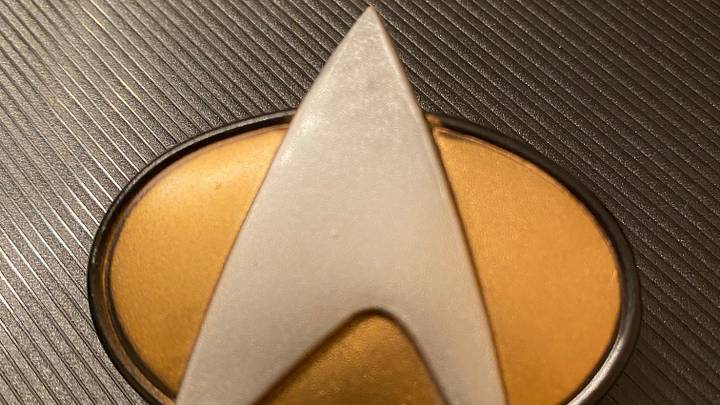
The visual style feels modern and polished without losing the Star Trek identity. The ship interiors and technology look futuristic and familiar without getting bogged down in unnecessary technical details. It feels like Star Trek through the lens of a contemporary young-adult webcomic; bright, expressive, and easy to follow as you scroll.
That accessibility is especially important for Recollection. The series is aimed at a young-adult audience and releases weekly on WEBTOON, meaning the artwork has to appeal to readers who may not be longtime Star Trek fans.
Episode 1 does a good job of striking that balance. It feels like a modern digital comic, but the visuals still capture the franchise’s sense of discovery, mystery, and uncertainty.
 Add us as a preferred source on Google